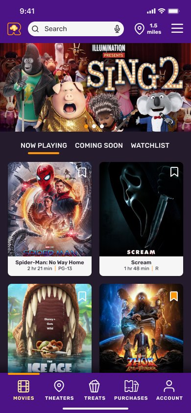
Reeling Mobile Ticketing App
Roles:
Lead UX Designer / UX Researcher
Objective:
Research and design a user-friendly ticketing app for a fictional theater company.
Understanding the user
User Personas
By conducting user interviews and synthesizing data into empathy maps during research phase of project, we were able to create 3 user personas that represented 3 major user segments.
This case study will focus on a single persona and the process used to create an inclusive product that addresses the pain points related to their movie theater experience.
Journey Map
I walked Lewis through a typical movie theater outing with his friends to see a highly-anticipated Sci-Fi movie. In addition to the general pain points discovered during user interviews, this journey map presented more specific opportunities to act on.
Defining User Pain Points
-
Pain Point 1
Coordinating with friends is a hassle. In a post-COVID world where all seats have to be reserved, one person has to pay and be reimbursed.
-
Pain Point 2
Not enough inside information about the movie. Actors, Directors and facts have to be researched carefully outside of app to avoid spoilers.
-
Pain Point 3
Theater selection is almost always based on location. Some users have a favorite theater that is NOT the closest to their location.
-
Pain Point 4
Waiting in line to get a single popcorn and drink takes far too long. Users have to wait behind larger families that have larger orders and hold up the line.
Ideation
Rapid Ideation and Sketched Wireframes
During this process of rapid ideation, I used the Crazy 8’s method to storyboard solutions for various pain points of Lewis. I chose to focus on the collaborative payment idea.
Digital Wireframes
The goal of this screen is to provide a clear way for users to add multiple types of tickets. Whether it’s a self-pay ticket of 3 different price points or a guest-pay ticket that is paid for by user’s guest(s).
Usability Studies
Round 1: I conducted a remote moderated usability study to determine what issues there might be with the current prototyped solutions.
Round 2: I conducted a remote unmoderated usability study using maze.co tool to confirm issues had been solved.
Low-Fidelity Prototype
Using Figma, a low-fidelity prototype was created in order to begin usability testing.
Usability Findings
-
P0. Confusion on Guest Pay
The top priority actionable insight revealed most participants got stuck or at the very least, frustrated with how the initial design worked. The action taken was to rework from scratch.
-
P1. The Stepper as a Navigation bar
A few of the participants tried to go forward or backward using the progress stepper. I found this interesting and explored the option of making it clickable for those that might try it. Ultimately, the stepper was left as-is to avoid potential issues later on.
Refining the Design
Before
After
Mockups
Accessibility
-
Color blindness
Mock-ups and design system for app were made using color blindness preview Figma plugin.
-
Vision Deterioration
Mock-ups and design system for app were made using ADA/WCAG size/contrast checker plugin in Figma.
-
Assistive Device Needs in Theater
A link to available assistive devices is included in the app so that movie-goers can get Audio Description devices, accessible seating, closed captioning and parking information.
Next Steps
-
Confirm all criteria have been met
All mock-ups should be double-checked that all user stories and acceptance criteria requirements have been met.
-
Present to stakeholders
Before proceeding with additional design changes, I would present final mock-ups to determine if there are any additional business, branding or technical constraints or concerns.
-
Revisit the other user personas and journeys
Once this 1.0 version has been handed off to dev team, I will return to the other user personas and journey maps to begin the process for the next iteration.


