Snapmoves by United & Mayflower
Roles:
Lead Product Designer / Researcher
Objective:
Traditional full-service moving solutions often do not accommodate smaller moves efficiently, leading to higher costs and logistical challenges for both customers and moving companies. Snapmoves aims to address this gap by offering a containerized solution, but the challenge was ensuring that customers:
Clearly understand how the service works
Feel confident in choosing a Snapmove over a traditional move
Can seamlessly navigate the online qualification and booking process
Process:
To tackle these challenges, I followed a structured UX process, including research, wireframing, prototyping, and iterative testing with stakeholders.
Understanding the Objective
Aligning on Vision
After meeting with our subject matter experts, development team, and business stakeholders to discuss requirements, I was able to update our Request A Quote Form process flow chart to share out with the team to ensure we were all aligned.
This updated user flow chart shows new entry point for qualifying customers and covers edge cases and error paths.
Customer Persona
Based on user interviews, we developed various user personas derived from the interviewee’s bio, experience, needs, goals and frustrations. For this project, our “Sarah” persona will serve as our guide with a residence size and budget that is a good representation of the customer segment that would qualify for this new Snapmove entry point.
Persona: The Busy Professional, 1BR Apt
Name: Sarah Mitchell
Age: 32
Occupation: Marketing Manager
Location: Chicago, IL
Family Status: Single
Current Home: 1-bedroom apartment
Moving To: 2-bedroom condo
Challenges:
Limited time to handle moving logistics
Needs reliable movers who can pack efficiently
Worried about fragile items like electronics and glassware
Goals:
Full-service move with packing and unpacking
Minimal downtime between homes
Hassle-free experience
Agent Research
Initial Agent Interviews
I conducted interviews with our member working group to understand their challenges, and expectations for how traditional Snapmoves are booked.
These discussions revealed a gap between the level of detail gathered during traditional Snapmoves (recorded by agent over phone) and what we could be reasonably expect a customer to provide unguided.
Ideation
Sketched Wireframes to FigJam
During this process, I first like to loosely sketch wireframes by hand. This can then be reviewed during design review or product sync. Once a rough idea of architecture is established, and if time permits, I move on to a low-mid fidelity wireframes in FigJam that can be more easily discussed with a broader group or quickly tested with peers.
Prototype and Agent Demo
High-Fidelity Prototype
Using Figma, a high-fidelity prototype was created in order to begin demoing with teams and agents.
Eventually, different prototype entry points were created and shared in Jira stories for easy access to start at the very beginning, the Snapmove entry point, error path and edge case paths.
This prototype was demoed to our member working group.
Agent Demo Findings
-
P0. Potential for Confusion on Opt-In Screen
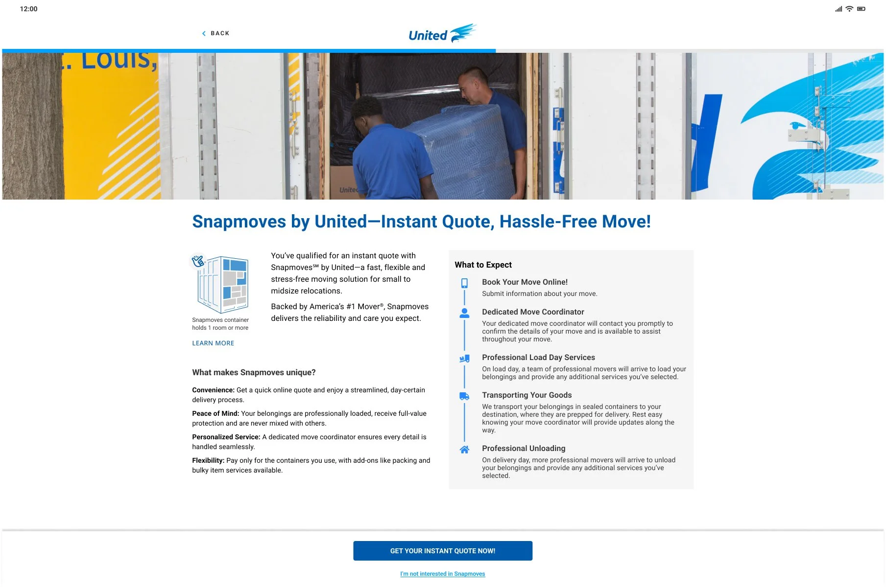
If the customer qualifies for a Snapmove, they are taken to an opt-in screen where they can read about what a Snapmove is and why they should select it. The call-to-action for opting in here was “I’m interested in Snapmoves”. We received feedback from various attendees that it felt more like a typical ad that they needed to bypass.
-
P1. Lack of clarity on container contents
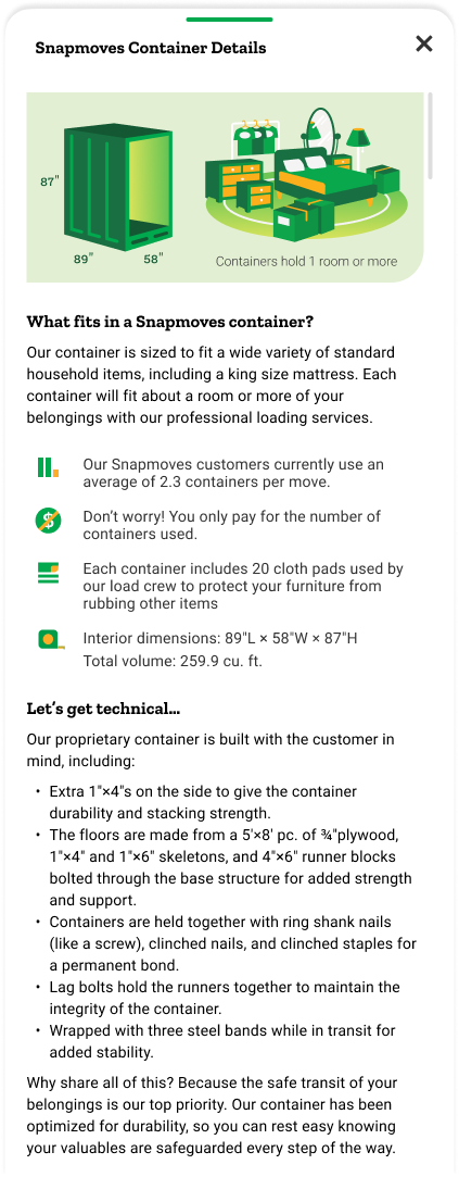
We received feedback that, despite the text descriptions of how much a container could hold, a visual would be needed. However this was not an image we had, nor would have time to get a professional shot of for MVP.
Refining the Design
P0. Clarifying Button Text
The original “I’m interested in Snapmoves” button label was confusing to customers and seemed like an extra offer that was going to take them away from their current goal of getting a quote. The updated “Get Your Instant Quote Now!” button label is more precise and is a better call-to-action because it spells out that the customer is on the correct path to accomplishing their goal.
Before
After
P1. Custom Illustration Solutions
These illustrations were created by me as a visual to provide clarity on what a Snapmoves container is and what it can hold. Using existing branded elements as a reference, I styled each brand’s component accordingly.
Bedroom contents - United
Bedroom contents - Mayflower
Packed Container - United
Packed Container - Mayflower
Next Steps
-
Responsive sizes and second brand
Once the design is approved, I move forward on creating various screen sizes based on our breakpoints—from iPhone SE to Desktop.
The initial design process focuses on one brand first. All approved screens for the other brand have to be created next. -
Prep files for hand-off
I will mark sections and screens as Ready for Dev. I will start with top-priority stories and start adding screenshots, attaching icons/images, and linking to prototypes and annotated Figma file.
-
Maintenance mode and cleanup
As we work through sprints, I will assist in providing any additional UX work as needed and review completed screens in our dev environment. This is the time I will also go in and clean up my file a little bit.
Mockups
Design System Initiative
Using Figma’s Variables feature, I started work on adapting our design system to have 3 additional modes—United, Mayflower, and Unbranded. This allows for us to only have to design one brand at a time and simply assign different modes to different sections. Here is a test of our Virtual Survey Feedback screen design.


