NAPA Digital Catalog
Roles:
UX Designer
Tools:
Adobe XD
Objective:
Create a Digital Catalog that sales/product managers can use as an alternative to a paper version that is not updatable and far more expensive to produce. This is a tablet-based application that would allow them to lookup, favorite, share and possibly place orders for items all in one location.
Process:
Define and Align on objectives
Ideate with LoFi wireframes
Prototype for demo and usability testing
Test with users and/or stakeholders
Refine based on changes
Mockups and hand-off
Wireframes
Developing Styles and Assets
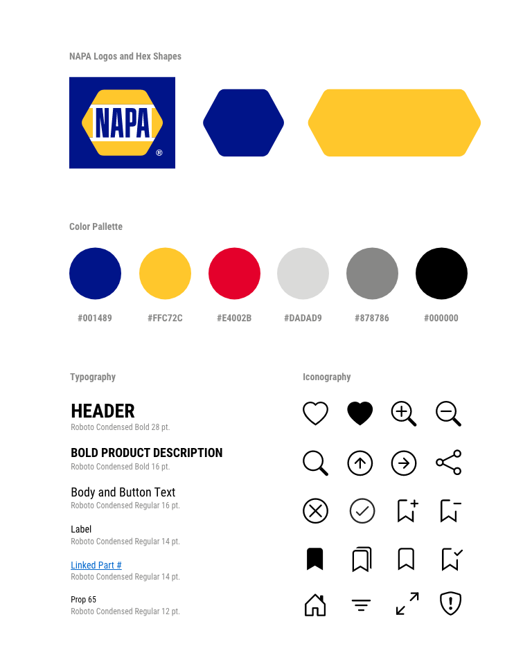
NAPA Assets
Using NAPA’s existing style guide, I converted colors to hex and established on-brand styles for Typography and Iconography that would be needed.
Robust Catalog Search
Search and Filter
One challenge is keeping a familiar way of searching for the product managers. They are accustomed to looking up by part numbers and names in the index as well as searching by categories in the catalog sections and subsections. A search bar was used to replace Index searches. Various drop-down filters like Category, Brand, Supplier and Type were added to mimic viewing catalog sections. As filters or keywords are applied, filter chips would appear to give the user a way to see all applied criteria in one spot as well as allow for easy removal of any filters.
Accessibility
Contrast Issue
I used more of a cyan color that is sometimes used across print materials to highlight the product part number. For this application, the part number would need to be a link that, when clicked, would take user into a detailed view of that part number and show inventory, last order status, other product images, etc. The link color did not pass contrast for AA, which was our minimum standards. Once I updated to the darker blue, it passed AA with a 5.56:1 contrast ratio.
General contrast was also checked using a color-blindness plugin.


